Which Prints Work Best for Women’s Sleepwear?
A blue-and-white stripe and a large botanical print can give the same pajama set two very different personalities. When you are choosing designs for a collection, finding several prints you like is often easier than deciding which ones belong together.
Stripes, florals, checks, polka dots and illustrated motifs all offer useful starting points for women’s sleepwear. The best choice depends on the look you want to create, how the artwork sits on the garment and the role of that design within your range. Here is how to compare them beyond the print name alone.
Stripes
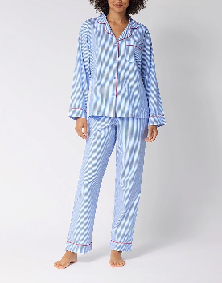
Stripes bring a clear, orderly structure to sleepwear. On a button-front shirt and matching pants, they work naturally with familiar pajama details such as a notched collar, chest pocket and contrast piping.
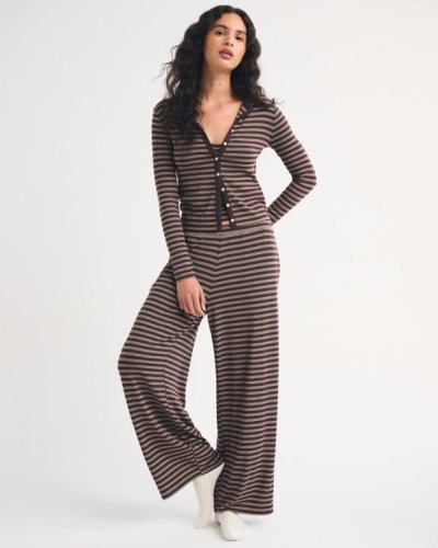
A fine stripe with plenty of background showing creates a quieter effect than broad bands of equal width. Blue and white suggest a crisp, traditional direction, while pink and burgundy or green and cream offer different ways to update the same idea. Several stripe widths within one repeat can also give the design more movement.
You can see this direction in Stripe & Stare’s women’s striped pajamas, a collection built around striped designs for sleeping and lounging.
Contrast piping adds another line to the garment, so its color deserves consideration alongside the stripes. Choosing a shade already present in the design keeps the details connected; introducing a new accent makes the collar and cuffs more noticeable.
Florals and Botanical Prints
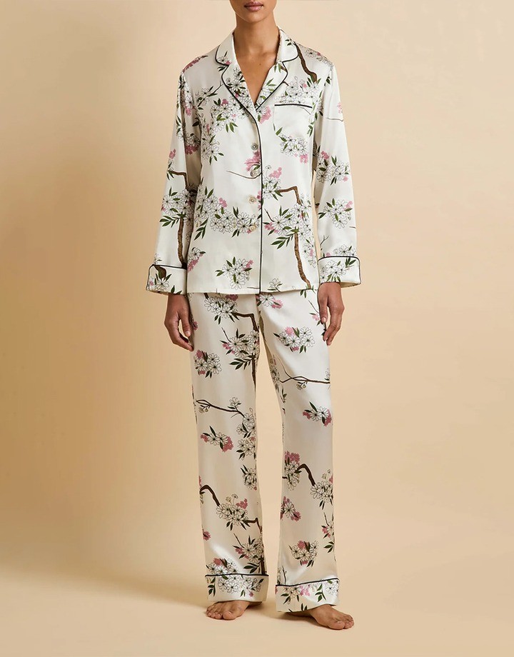
Floral pajama prints cover a wide range of looks. A tiny scattered blossom, a detailed garden scene and a large tropical leaf may all fit this category, but they give a collection very different identities.
Small flowers with fine outlines lend themselves to a delicate, vintage-inspired direction. Larger blooms give the artwork more presence, especially when the petals have strong shapes or contrasting colors. Botanical designs built around leaves and stems offer another option when you want a nature-inspired theme with less emphasis on flowers.
The drawing style matters too. Soft watercolor edges give a different impression from a sharply outlined illustration, even when both use the same flower. A two-color line drawing can feel restrained, while a richly colored garden print makes the artwork the main feature of the set.
If you are comparing several floral options, look at how the flowers and leaves relate to each other. A single repeated flower creates a simpler rhythm; intertwined stems and mixed blooms create more of a continuous scene. This distinction helps narrow the choice before you begin changing colors.
Checks and Plaids
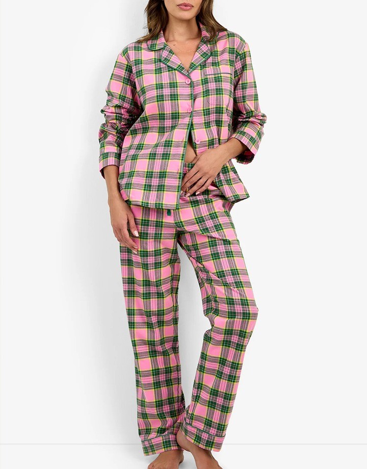
Checks give sleepwear a repeating grid, with options ranging from simple gingham to layered tartan designs. Gingham usually has an even check formed by crossing bands, while tartans combine bands of different widths and colors into a more complex pattern.
A small check in lilac and white offers a different direction from a large red-and-navy plaid. The first might accompany a softly gathered neckline or a short set; the second could suit a traditional pajama shirt. These are styling possibilities, and neither pattern needs to be confined to one season.
Holiday associations often come from the combination of pattern and palette. Red-and-green tartan makes that connection explicit, while a blue or muted neutral version can sit within a broader everyday range. Changing the colors can be more useful than replacing the whole pattern when you want a related design for another delivery.
Both stripes and checks describe visual patterns, which may be printed onto fabric or formed with colored yarns. When comparing references, keep that distinction in mind so the desired appearance is clear.
Polka Dots
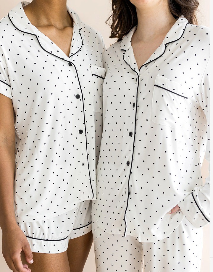
Polka dots offer a simple motif with plenty of room for variation. Tiny dots spaced across a plain ground give a subtle patterned effect, while large circles create a stronger graphic look.
Regular rows make the design feel orderly. A scattered arrangement introduces a looser rhythm, and slightly irregular dots add a hand-drawn quality. Black and ivory create a clear contrast; colors closer in tone produce a softer result.
Dots are also a useful starting point when the garment already has decorative details. A small, simple repeat leaves room for a scalloped edge, shaped collar or contrasting trim. With larger dots, those details share attention with the pattern, so the combination benefits from a more deliberate balance.
Novelty and Illustrated Prints
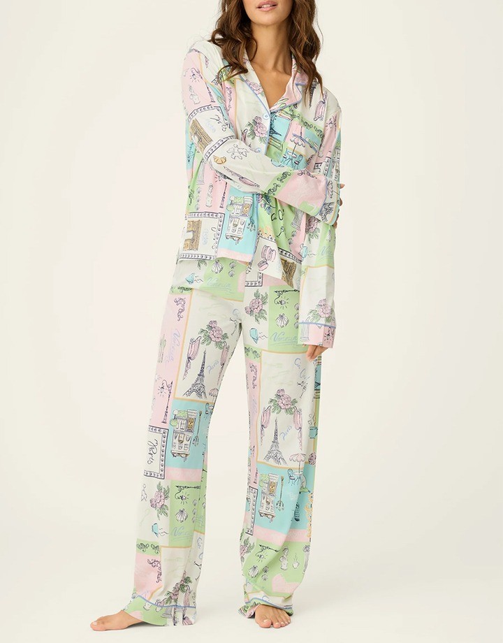
Animals, fruit, travel scenes and hobby-related motifs give sleepwear a recognizable subject. This is a useful direction when you want the print to express a particular interest or carry the theme of a collection.
An animal illustration and an animal-skin pattern create different effects. Small drawings of dogs or birds tell a more literal story, while leopard spots or zebra markings work as repeating surface patterns. Separating those ideas makes it easier to choose references that point toward the same result.
Scene-based illustrations offer another approach. Buildings, landscapes or small groups of objects can form a more detailed repeat, with discoveries spread across the fabric. The drawing should remain readable at its intended size, particularly when it includes fine lines or small objects.
Printfresh’s themed sleepwear collections include examples such as Holiday Hens and Good Dog Christmas, showing how a subject can connect an illustrated print to a seasonal range. For your own collection, the subject and drawing style should have a clear connection to your brand, giving customers something they can recognize across different pieces.
How to Choose Prints for Your Sleepwear Collection
The following comparison is a starting point for narrowing your direction. Each category allows for both subtle and expressive designs.
| Visual character | Possible collection direction | |
|---|---|---|
| Stripes | Linear and structured | Tailored pajama sets and coordinated essentials |
| Florals and botanicals | Organic and decorative | Romantic, vintage-inspired or statement pieces |
| Checks and plaids | Repeating grid | Everyday sets or seasonal variations |
| Polka dots | Simple and rhythmic | Understated patterns or graphic designs |
| Illustrated motifs | Subject-led and distinctive | Themed capsules and gift collections |
Color, Scale and Spacing
Once you have chosen a print direction, compare the artwork at the size it will appear on the garment. A small image on a screen can make a large repeat look much finer than it will on a full pajama set.
Consider a lemon illustration, for example. Small lemons scattered widely across an ivory ground leave much of the base color visible. Enlarging them and adding dense leaves creates a fuller, more decorative surface, even if the individual drawing stays the same.
Before deciding between two options, view them on the same garment shape at a comparable scale. This makes the differences easier to judge. During custom pajama sampling, a fabric or garment sample can then help confirm how that choice looks away from the screen.
The Garment Silhouette
A long-sleeve shirt and full-length pants display a much larger area of pattern than a camisole and shorts. A detailed scene has more space to unfold across the longer set, while a smaller garment may show only fragments of it.
Collars, pockets, gathers and trims also change the view. A large illustration may be interrupted by a front opening, while gathering brings parts of the design closer together. On a simple slip-style nightdress, there are fewer details competing with the artwork.
When choosing across different women’s sleepwear styles, consider which part of the print should remain recognizable on each piece. You may keep the same artwork throughout the range or adjust its scale to suit a particular style.
The Role of Each Print in the Collection
Give each design a reason to be in the range. A quieter pattern might provide an everyday option, while a more expressive illustration introduces a particular theme. A holiday design can have a clear place in a seasonal release without setting the direction for the entire collection.
A shared palette helps different motifs sit together. For example, a blue-and-cream stripe, a small floral using the same blue, and an illustrated design with cream as its ground could form a connected group. The link comes from their colors, while the different motifs give customers a choice.
If you already sell sleepwear, your own results can help refine that selection. Compare similar styles and price points when reviewing print performance, and account for stock availability and promotions. A design that sold out after a small initial order needs a different interpretation from one that maintained sales through several replenishments.
FAQs
Can novelty prints work for premium sleepwear?
Yes, playful motifs can fit a premium collection when the illustration, colors and garment details follow a clear design direction. Refined drawing and restrained trims help keep the look cohesive.
Can you combine prints and solid colors in a sleepwear collection?
Yes, coordinating solids can connect different prints within one range. Choose shades from the artwork that work across tops, bottoms and robes, giving the collection more combinations without adding another print.
Do stripes and checks need to match at the seams?
Matching matters most at visible areas such as the shirt front and pockets. Specify the areas that should align during development, since matching every seam may be impractical.
Do printed pajamas fade after washing?
They can, so assess colorfastness on the actual printed fabric. Ask for wash-test results and review samples before and after laundering under the agreed care conditions.
Conclusion
Choose prints with a clear idea of how you want your collection to look. Before adding another design, ask whether it offers a distinct option while still feeling connected to your brand.
Share your print references, preferred colors and sleepwear styles with our team to discuss custom printing and design details.